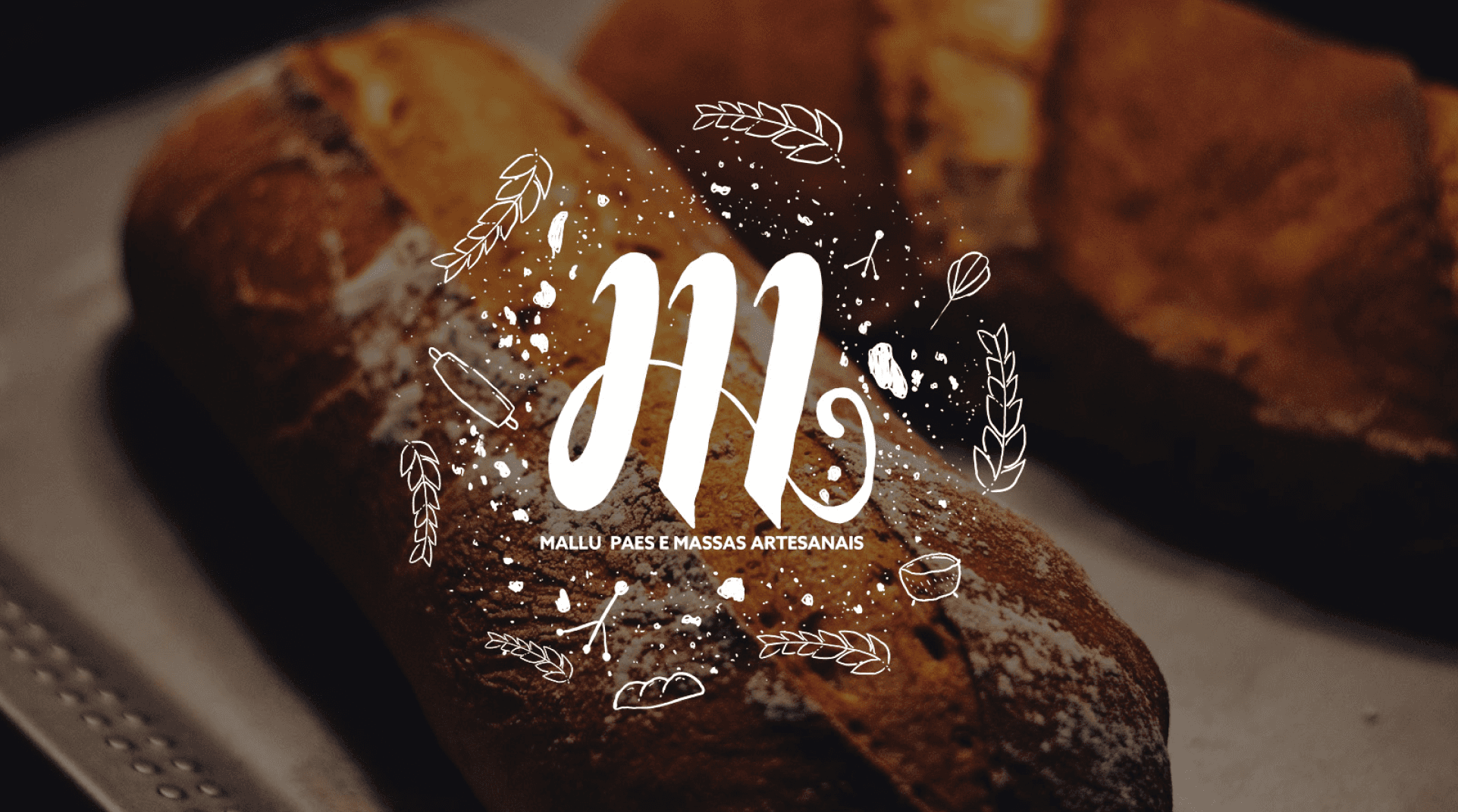
Mallu Pães
A handcrafted bakery brand born from a father-daughter love story. The challenge was translating an entirely human, warm and organic tradition into a visual identity that could stand proudly in modern markets — without losing a single gram of soul.
Branding · Logo Design · Visual Identity · Packaging — 2023
- Year
- 2023
- Role
- Brand Designer
- Client
- Mallu Pães
- Scope
- Branding · Visual Identity
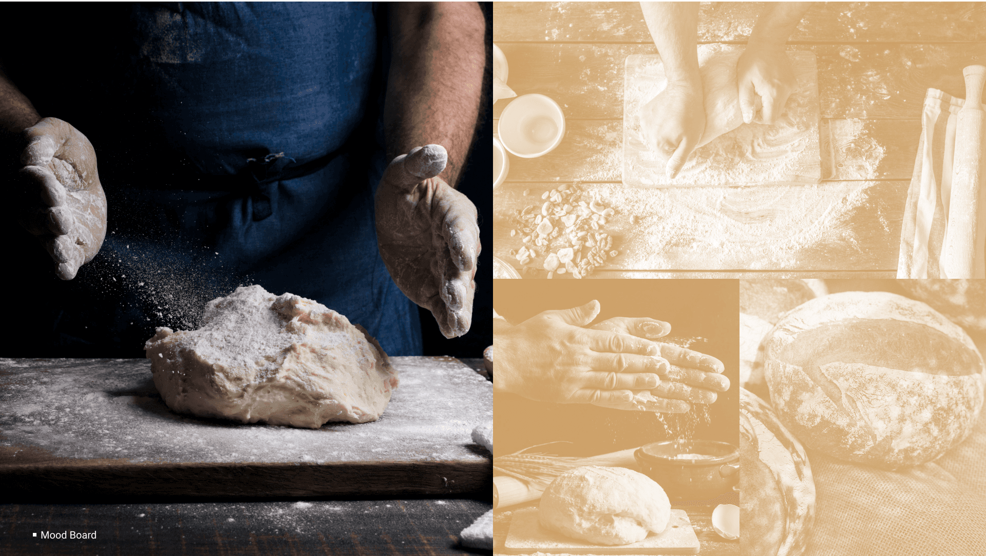
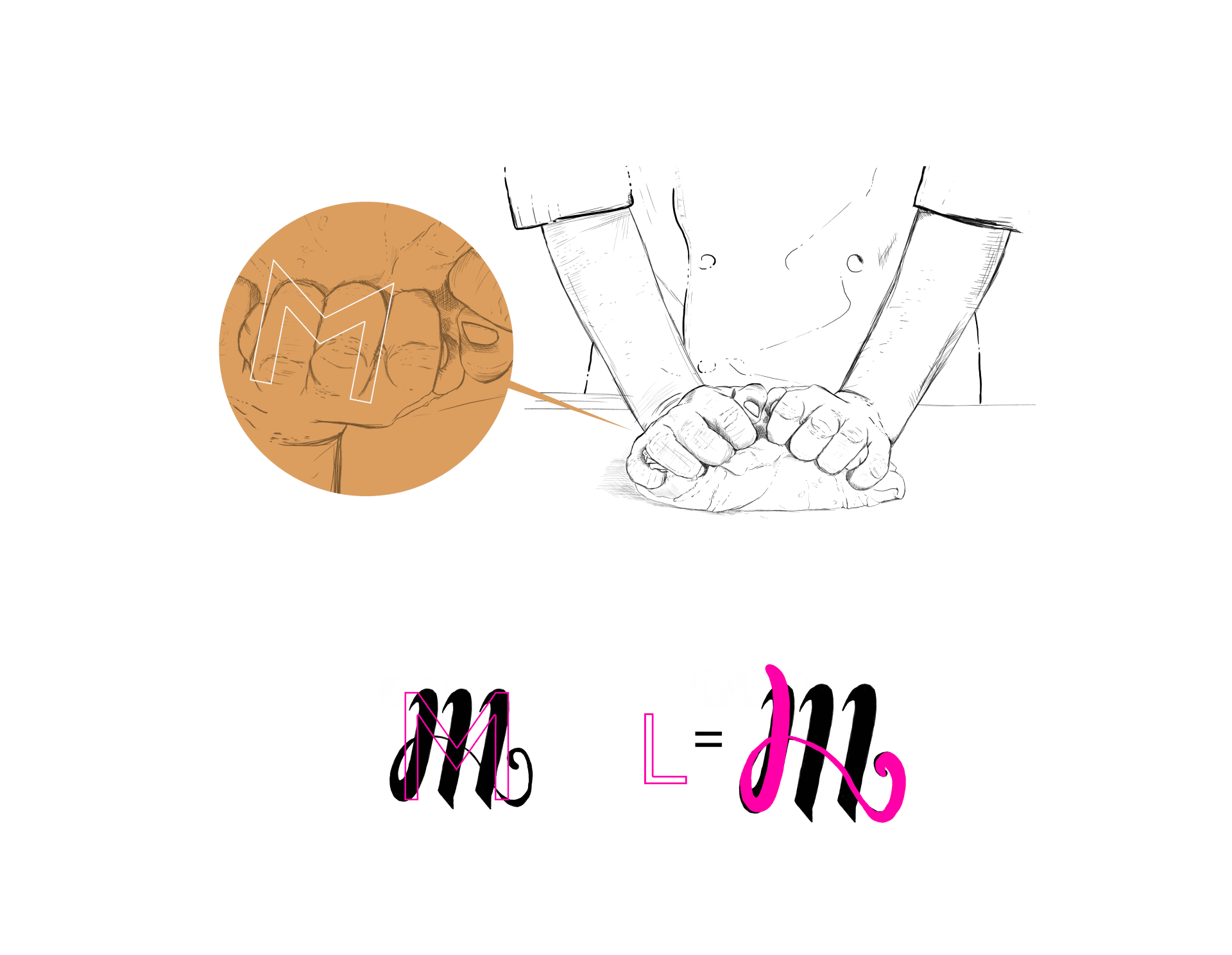
Brand mark development — hands, the letter M, and flour as texture
Brand applications across packaging, stationery and collateral
Full brand rollout — identity applied across all touchpoints

Packaging — kraft textures, warm earth tones, hand-crafted feel
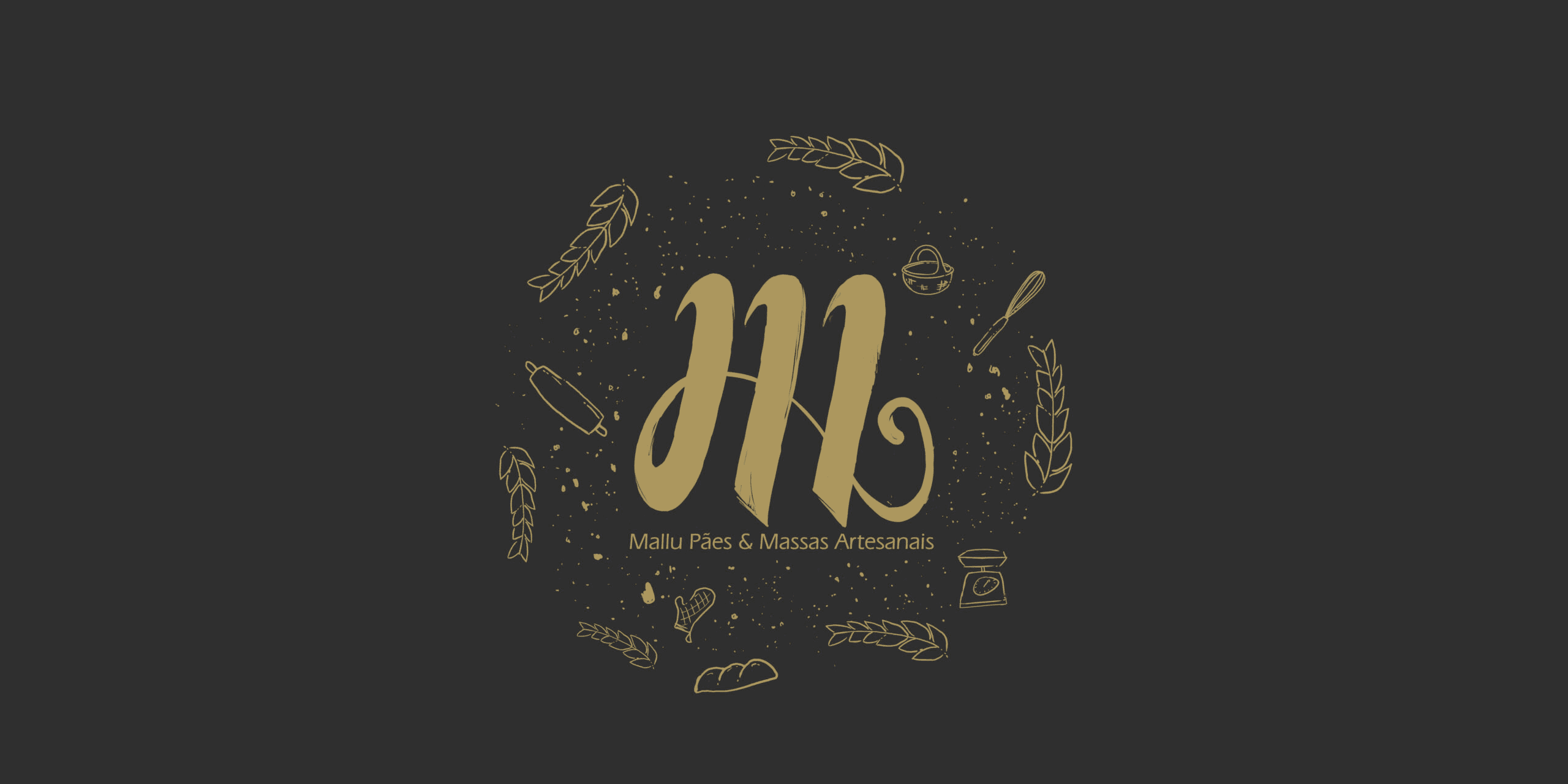
Brand collateral — consistent visual language across every surface