Case Study
Sky Entertainment Platform
Redesigning the live TV and content discovery experience for 11 million Sky subscribers across Europe.
Year
2022–2023
Role
UI/UX Designer
Company
Sky UK
Platform
TV · Mobile · Web
Overview
Sky's legacy TV Guide had served millions of viewers for over a decade, but it was struggling to keep pace with how people consume content today. Cluttered grids, inconsistent navigation, and a fragmented experience across devices had eroded satisfaction. My role was to lead the UI redesign of the Entertainment Platform — beginning with the TV Guide (EPG) and expanding into the content discovery homepage and cross-device design system.
My Role
UI/UX Designer
Team
1 Lead UX, 3 UI Designers, 2 Researchers, PMs
Timeline
14 months (2022–2023)
Platform
Sky Glass TV, Sky Go Mobile, Sky.com
Tools
Figma, After Effects, Photoshop
Problem
A beloved product showing its age
Sky's Electronic Programme Guide (EPG) hadn't seen a fundamental rethink in years. Despite Sky's enormous content library — over 500 channels, thousands of on-demand titles, and new streaming integrations — the interface was still built around a rigid time-based grid that made discovery feel like searching a spreadsheet.
Internal usability research revealed that 63% of users felt overwhelmed when browsing channels, and average time-to-play had increased by 40% over three years. Younger subscribers, accustomed to Netflix and Disney+'s recommendation-led surfaces, were disengaging at alarming rates.
The challenge wasn't just visual polish. It was rethinking how 11 million people — ranging from elderly viewers in rural UK to tech-savvy families streaming across five devices — find what they want to watch.
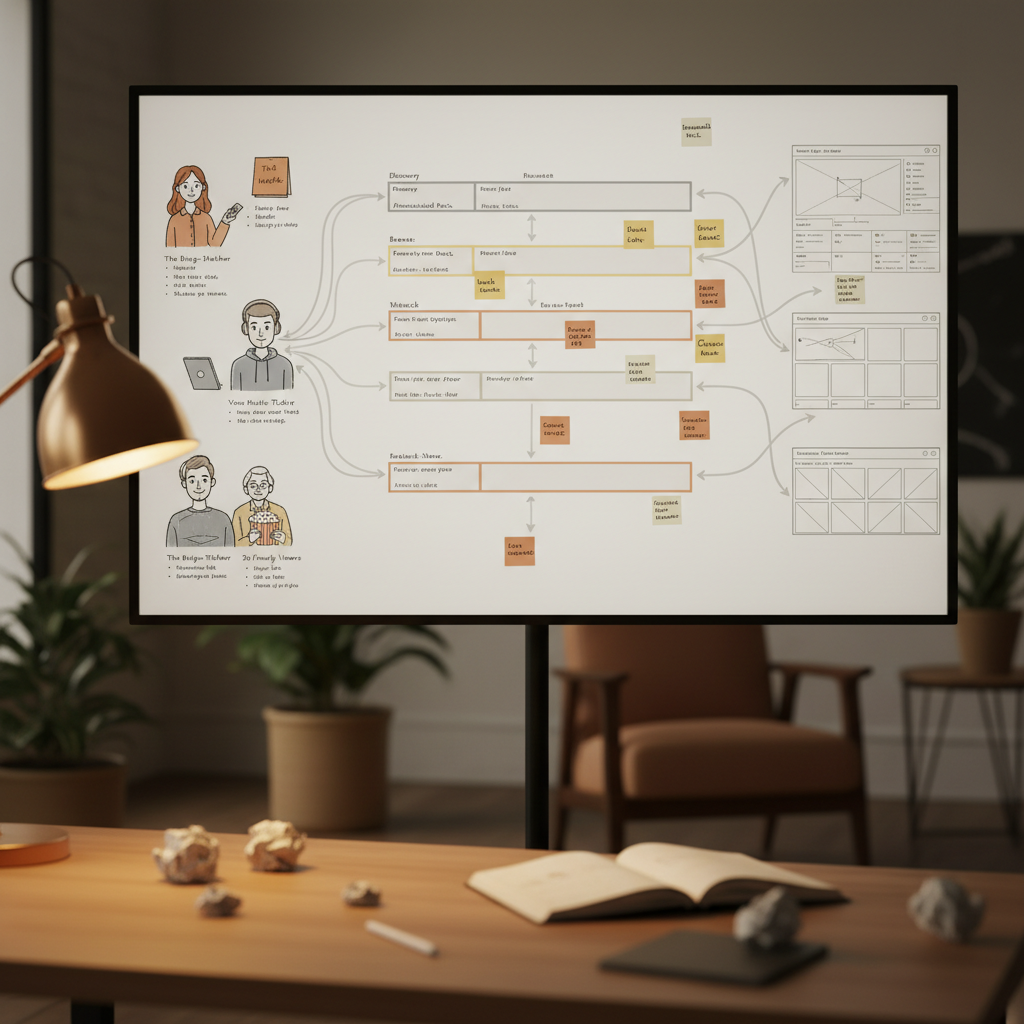
Discovery phase: user journey mapping, persona workshops, and stakeholder alignment sessions
Research & Discovery
Understanding 11 million different living rooms
We kicked off with a three-week discovery sprint. I collaborated with the UX Research team to synthesise existing data and conduct new contextual research — visiting viewers in their homes across London, Manchester and Glasgow to observe natural TV watching behaviour.
We mapped three distinct user archetypes: the Lean-Back Viewer (passive, channel-surfing), the Intent-Driven Watcher (knows exactly what they want), and the Social Viewer (watching with family, negotiating what's on). Each had radically different needs from the same interface.
Competitive analysis covered Netflix, Disney+, Apple TV, and Amazon Prime. We found a clear gap: Sky's content breadth was unmatched, but the surface for surfacing it was lagging. The opportunity was to combine the familiarity of live TV with the intelligence of streaming platforms.
"I just want to put the TV on and find something good. I don't want to feel like I'm doing admin."
— Research participant, Manchester — Sky subscriber for 12 years
Key findings
- Users spent avg. 8.4 minutes browsing before selecting content — nearly double the industry benchmark
- 63% felt the EPG was hard to navigate when they didn't know what they wanted
- Mobile users were completely underserved — the Sky Go app had a different UI logic to the TV
- Discovery of on-demand and streaming content was nearly invisible inside the EPG
- Accessibility needs were underaddressed — particularly for users with low vision
Design principles we defined
- Reduce time-to-play above everything else
- Progressive disclosure — show what matters, reveal depth on demand
- One consistent experience across TV, phone and tablet
- Contextually intelligent — surface what's right for now, not just what's on
- Accessible by default, not as an afterthought
Design Process
From whiteboard to 55 inches
Designing for a television is fundamentally different from designing for a screen you hold in your hand. The 10-foot experience demands different type scales, interaction patterns, and visual hierarchy. We ran daily design critiques with engineering, weekly playback sessions with the product team, and bi-weekly user testing with a panel of Sky subscribers.
I owned the visual design language — defining the new type system (Sky Text, a proprietary font), the colour hierarchy (with live TV in warm amber, on-demand in deep navy, and streaming integrations colour-coded), and the spatial grid that worked across TV resolutions from HD to 8K.
We prototyped at full fidelity in Figma, then moved to Apple TV and Android TV test builds for real-environment testing. What looks great on a laptop often falls apart on a 65-inch screen from three metres away. Many of our early type sizes were far too small. Motion design played a huge role — transitions had to feel smooth and intentional, never distracting.
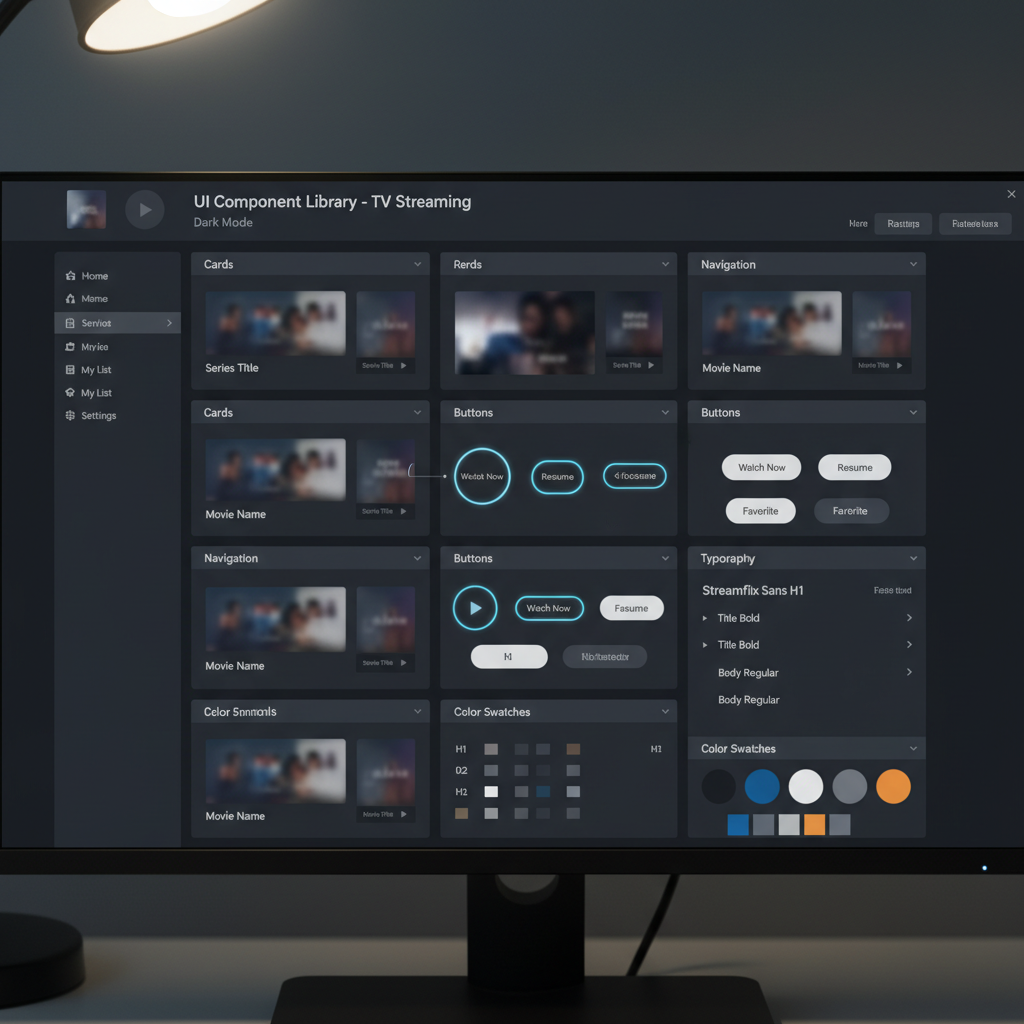
The Sky Entertainment Design System — built in Figma with 400+ components, 8 layout grids, and full dark/light mode support
Design System
Building the foundation, not just the surface
One of the most impactful contributions of this project was establishing a shared design system across Sky's Entertainment team. Before this work, different teams working on TV Guide, Sky Go, and Sky.com were each maintaining their own component libraries — leading to inconsistencies, slow delivery, and duplicated effort.
I led the design side of the Sky Entertainment Design System, working alongside engineers to create a token-based, component-driven library that could scale across platforms. The system introduced semantic colour tokens (so light and dark mode worked automatically), a responsive type scale, standardised interaction states, and motion guidelines.
The result: new feature teams could ship consistent UI in a fraction of the time, and QA processes dramatically shortened because the baseline quality was higher.
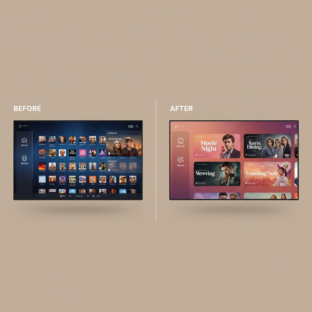
Before (left) vs. After (right): From a dense channel grid to an intuitive, content-first discovery surface
The solution
A new kind of TV Guide
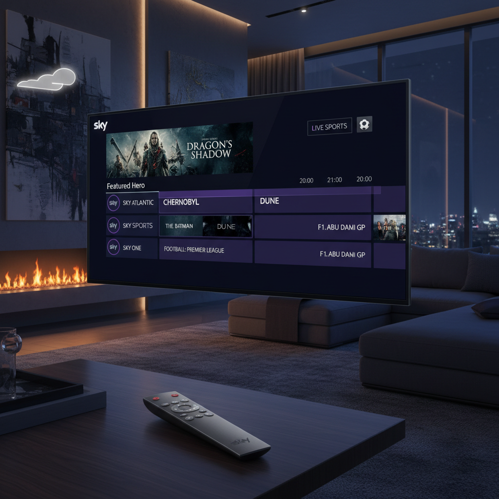
The redesigned Sky Entertainment Platform launched across Sky Glass and Sky Go in Q3 2023. The new TV Guide moved away from the rigid hour-based grid as the primary surface — instead, a smart home screen powered by personalisation surfaced the most relevant content for that moment, with the full EPG grid one click away for those who wanted it.
Navigation was simplified from seven top-level categories to four, with contextual sub-navigation emerging based on what you were doing. Live TV, on-demand, and streaming integrations (Netflix, Disney+, Apple TV+) were unified into a single browsable surface for the first time.
The mobile experience was fully redesigned to mirror the TV logic — users could start watching on the phone and seamlessly continue on TV, a much-requested feature that now worked fluidly.
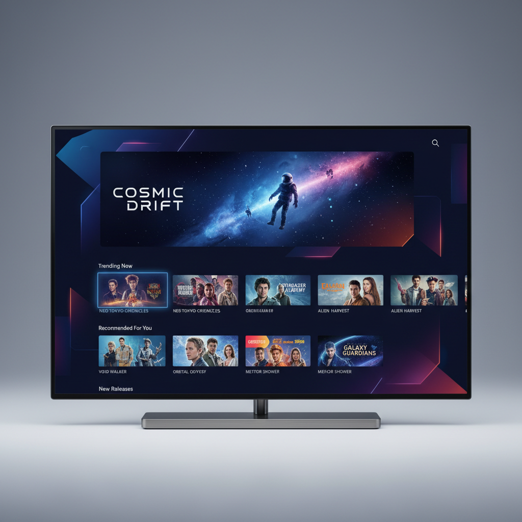
The new Sky Entertainment home screen — personalised, content-first, and built for the lean-back experience
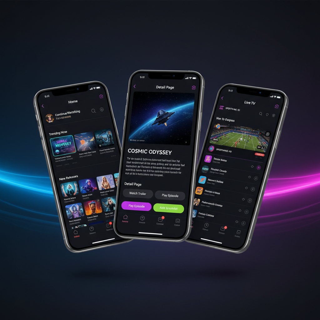
Sky Go mobile — redesigned to share the same design language and navigation logic as the TV, enabling true cross-device continuity
Impact & Results
38%
Reduction in time-to-play
from avg. 8.4 min to 5.2 min
4.5★
App Store rating
up from 3.1★ pre-redesign
+22%
Content discovery engagement
more content browsed per session
11M+
Users impacted
across UK and European markets
Reflection
What I'd do differently
This project was one of the most complex I've worked on — not because of any single design problem, but because of the sheer scale of constraint. Every decision touched millions of people with wildly different needs, abilities, and contexts.
If I were starting again, I'd invest more heavily in accessibility research at the beginning rather than retrofitting it later. We made the platform significantly more accessible, but it was harder work than it needed to be. Accessibility should always be a founding principle, not a feature.
I'd also push earlier for a unified content model between TV and mobile. The technical debt from treating them as separate products added months to the delivery timeline. The design solution was clear early — the engineering alignment took much longer.
That said, the project taught me more about design at scale than anything else in my career. Collaboration, communication and trust — between design, engineering, product, and research — were ultimately the most important tools I used.
Next Project