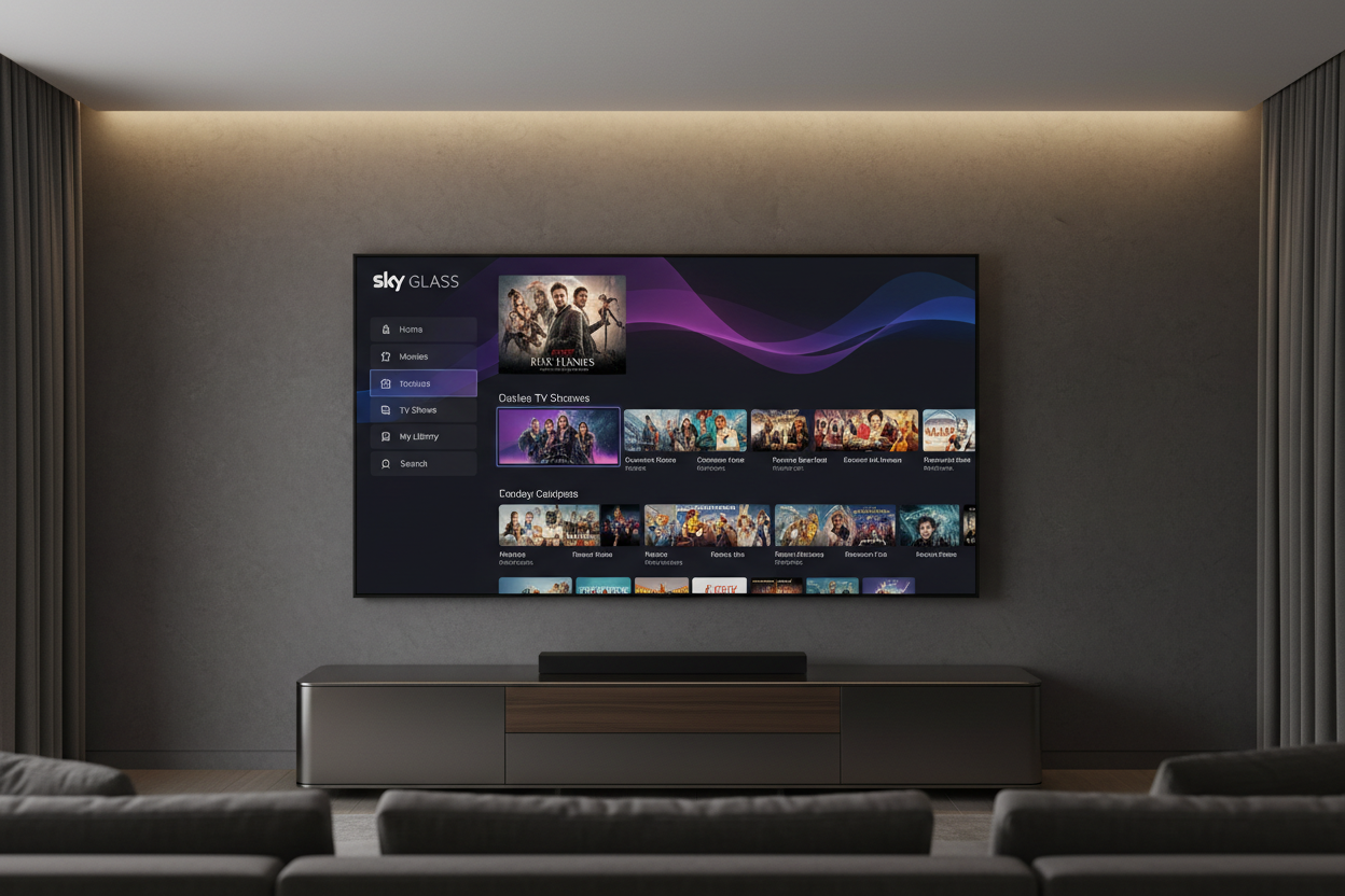
Case Study · UI/UX · Product Design
Sky Glass
Sports Dashboard
Year
2025–2026
Role
UI/UX Designer
Company
Sky UK
Platform
Sky Glass · Sky Stream · Sky Q
Sky Sports launched a new immersive sidebar for the 2026 F1 season — giving viewers on Sky Glass, Sky Stream and Sky Q access to live race data, onboard cameras, team radio and race control decisions, all without leaving the broadcast. This is the story of the design decisions behind it.
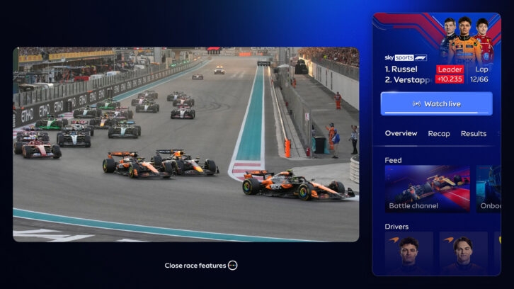
The immersive sidebar — a live data layer alongside the broadcast, not instead of it
Live sport is more than what's on screen
Modern sports fans don't just watch — they analyse, compare, replay and discuss in real time. Sky's existing TV experience served the broadcast brilliantly, but left a huge gap for data-hungry viewers who wanted race standings, team radio, driver onboards and race control decisions — all without leaving the live feed. The sidebar was born to close that gap.

Sky Sports 2025 rebrand — "Welcome to the show" — editorial, bold, fan-first
Live is still king — data serves the crown
From the outset, the core design principle was clear: the broadcast is always primary. The sidebar should enrich the experience without competing with it. This meant treating the sidebar as a contextual overlay — collapsible, dimmable, and always subservient to the main picture. Every design decision flowed from one question: does this serve the fan, or does it distract them?
"There is so much choice in sports now, and so many formats. But for us, live is still king. It's the centrepiece of the experience."
— Alex Haley, Group Creative Director of Brand Design — Sky
Sky Sports Sans — five weights, angular cuts, sharp terminals, built for warmth and clarity
A brand rebuilt for the digital era
In parallel with the sidebar, Sky Sports undertook its most significant visual rebrand since 2017. Six sport-specific fonts gave way to a single family — Sky Sports Sans — developed with F37 Foundry in five weights. The 2017 sport sub-brand architecture, which had fragmented the master brand, was dissolved. A new unified design language emerged: bold, editorial, and built around the Sky Sports roundel as a 'stage device' — a frame for the stories being told.
The sidebar in action — live standings, Race Control and onboard feeds alongside the broadcast
Feature Set
Three panels. One seamless experience.
Race Control
Live decisions and communications from the FIA stewards — safety car, DRS, penalties, virtual safety car. Designed as a scrolling ticker that never obscures the primary feed.
Driver Onboards
Selectable livestreams from all 20 drivers during every session. One tap to switch. Driver helmet cams, cockpit cams, and onboard audio — including live team radio.
Live Standings
Real-time championship and race standings with gap-to-leader data. Persistent and collapsible — always available, never in the way. Designed for the lean-back viewer who wants context without friction.
Sky Sports 2025 identity — Sky Sports Sans, unified roundel, editorial energy
F1 sidebar detail — data density, no visual compromise on the live picture
Outcomes
20
Onboard livestreams
one per driver, every session
3
Core sidebar panels
Race Control · Standings · Recap
100%
Session coverage
race, sprint, qualifying, practice
1
Unified sports surface
sports + data + live — one experience
Reflection
The constraint that sharpened everything
Designing a data layer for live sports on a 10-foot TV experience is uniquely unforgiving. Every element had to earn its place — not just against user needs, but against the broadcast itself, which is always the hero. The sidebar forced us to design with radical restraint: maximum information value, minimum visual imposition.
The parallel rebrand of Sky Sports — moving from six sub-brand fonts to a single Sky Sports Sans, and dissolving the fragmented channel architecture — meant we had a unified design language to build on for the first time. That consistency was transformative for component reuse and cross-platform delivery.
Next Project