Case Study
BeNua
A complete brand identity built around intimacy, self-discovery, and the freedom to be exactly who you are.
Year
2020
Role
Brand Designer · Art Director
Company
BeNua
Platform
Brand Identity · Campaign

Overview
BeNua is a new lifestyle brand that offers much more than just products. BeNua's vision is to connect people and humanise the brand — seeking intimacy and respect of the body discovering itself again. Get rid of preconceptions and get ready for something new. Be you, and not the version of yourself that society imposes on you.
My Role
Brand Designer · Art Director
Scope
Full brand identity, naming, visual language, campaign
Target
Independent women, 27–45 years old
Tools
Illustrator, Photoshop, Figma
Concept
To be naked is to be free
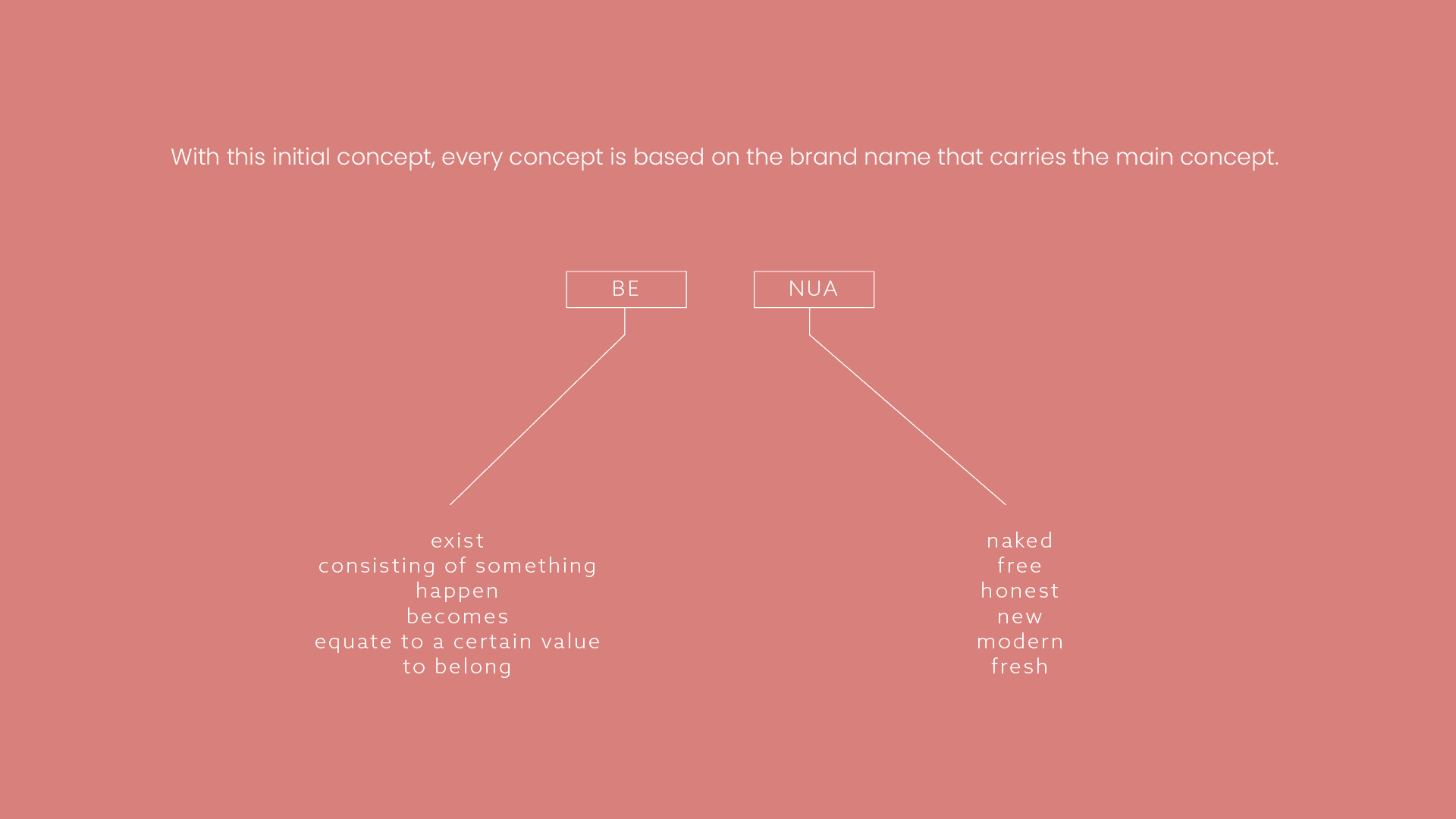
The concept was built around the brand name, which carries multiple symbols and meanings tied to new beginnings and breaking free from prejudices and taboos. As a newcomer to the market, BeNua embraces a communication style that is light and subtle, yet strong and visually impactful.
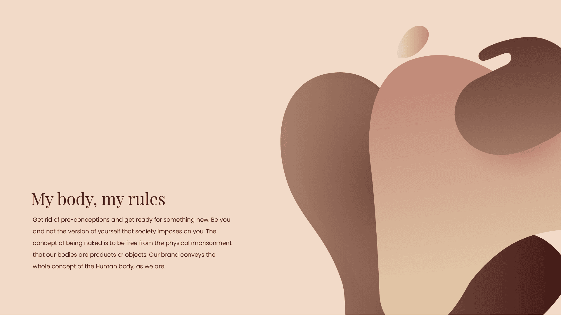
The main function of the brand is to create a connection between a woman and her body. Over time we have seen art forms — the Renaissance, Greek sculptures — which portray the naked female form in a beautiful and confident way. Aligned with this, BeNua's branding replicates the curves of a woman and encourages confidence and the opportunity to discover yourself again.
Adding aesthetic values to the brand makes it possible to expand in the future to new types of products beyond the core range: skincare, body creams, décor, household objects, and art for the home.
"The context changes the perception of nudity."
— BeNua brand manifesto
Brand manifesto — 'to be naked is to be free'
Target & Positioning
For women who love their freedom
Independent women, between the ages of 27 and 45. Determined and on the path to achieve what they set out to do. Single or in a relationship — women who love their freedom.
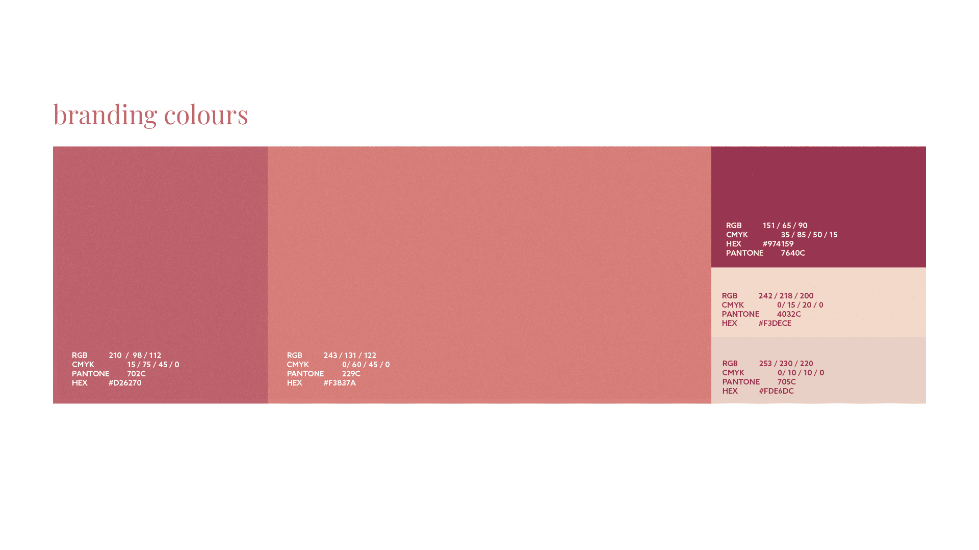
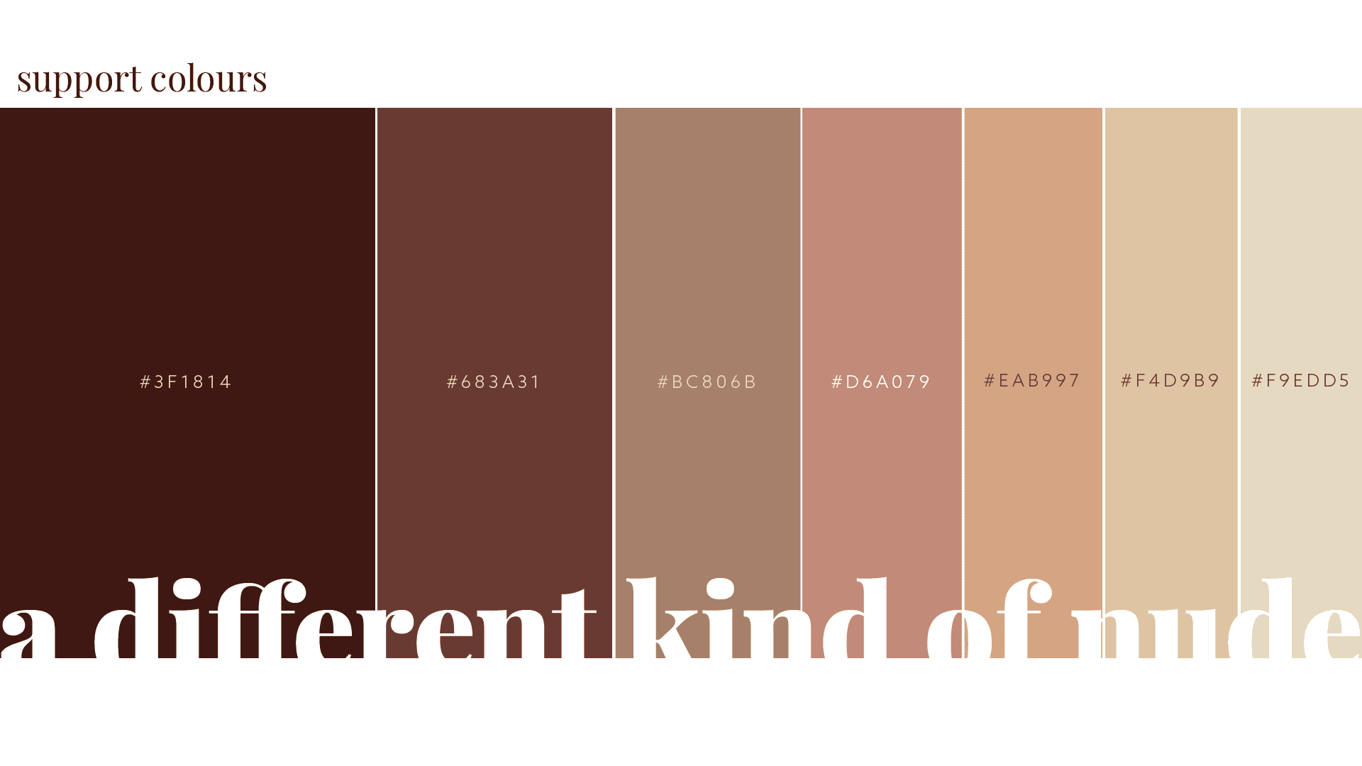
With a target audience of women in this range, the colour palette and shapes were carefully designed to resonate with a feminine sensibility. The branding emphasises discretion and versatility, allowing the identity to be shared, printed, and applied across different contexts without being directly associated with its category — but rather with self-discovery, confidence, and pride.
BeNua needed to feel like a brand that someone would be proud to have on their shelf, their bathroom counter, or their Instagram feed. Every visual decision served this ambition.
Visual language — feminine curves, soft tones, confident restraint
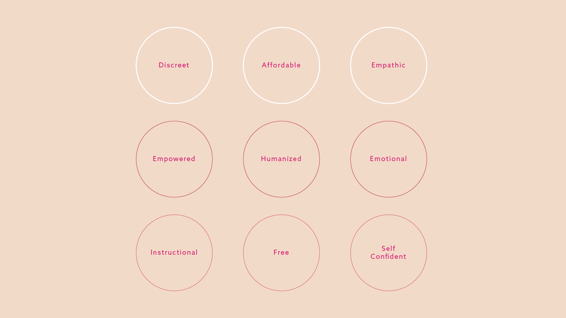
Brand values
- Self-discovery — encouraging women to reconnect with themselves
- Confidence — through discretion, not provocation
- Versatility — identity that works across all contexts and touchpoints
- Modern femininity — inspired by the beauty of the female form in art
- Breaking taboos — light and subtle, yet visually impactful
Visual direction
- Colour palette built around soft, warm tones that resonate with feminine sensibility
- Shapes inspired by the curves and forms of the female body
- Typography: clean and considered — strength through restraint
- Photography: confident, intimate, never exploitative
- Expandable system — designed to scale into new product categories
Brand applications — packaging, typography and identity system
Colour palette — warm, subtle, and consistently feminine
Brand Applications
A system designed to scale
The identity was applied across a full suite of brand touchpoints — from packaging and product design to campaign photography and social media templates. Each application maintained the same visual language: warmth, curves, confidence and restraint.
Campaign photography was art-directed to embody the BeNua philosophy — intimate and proud, never salacious. The context of nudity was reframed through editorial direction that drew from fine art rather than from the conventions of the category.
The result is a brand that any woman in the target audience would be proud to associate with — and that can grow with the company as its product range expands.
Brand identity applied across packaging, product and campaign materials
Campaign art direction — confident, intimate and proud
Visual identity in use — packaging, print and digital applications
Next Project