Case Study
Cult Furniture
Revamped Cult's branding and website for consistency, engagement, and improved user experience across web and mobile.
Year
2021
Role
UI/UX Designer · Brand Designer
Company
Cult Furniture
Platform
Web · Mobile · Brand
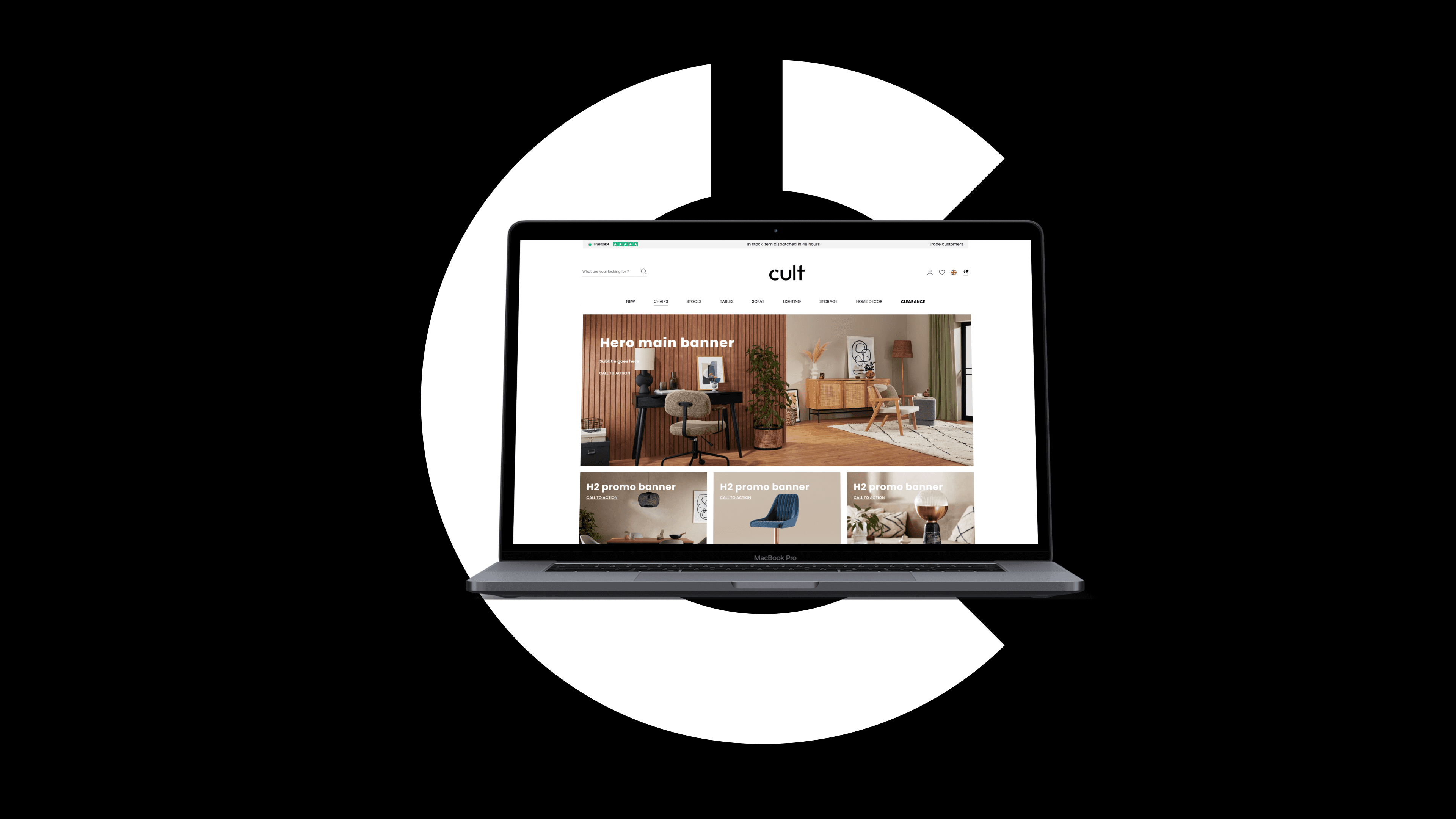
Overview
Cult is a fresh and dynamic furniture brand, bringing stylish furniture and home decor to young professionals and design-conscious individuals. By consistently applying our brand across all communications, we reinforce what sets us apart. Cult aims to create fresh, dynamic designs that are as affordable as they are stylish, offering modern and innovative interiors for the fashion-forward.
My Role
UI/UX Designer · Brand Designer
Scope
Brand identity, web redesign, email marketing, social media
Platform
Web (desktop & mobile)
Tools
Figma, Photoshop, Illustrator
Problem
A brand without a visual language
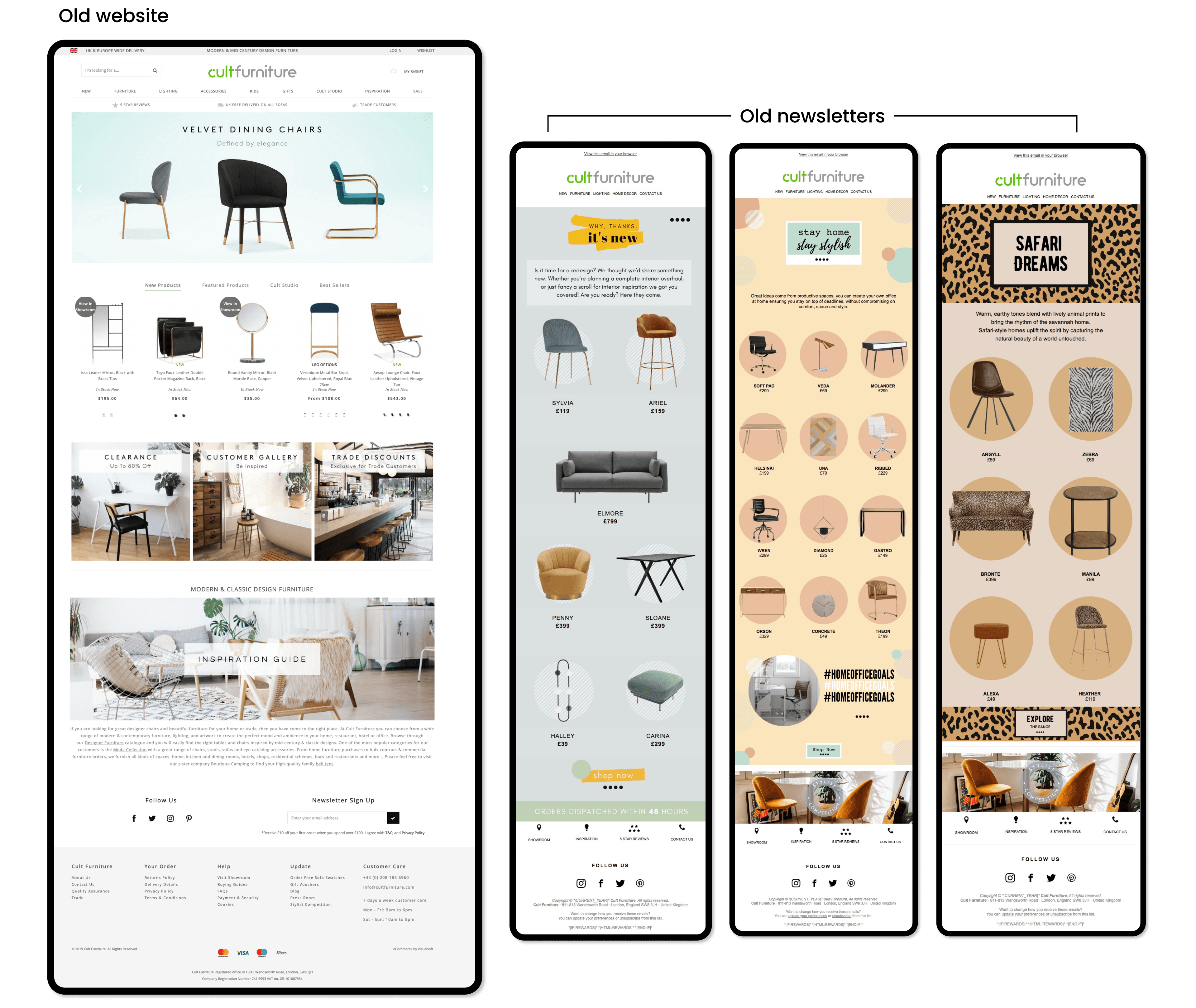
For many years, the colour green was the official colour of the Cult Furniture e-commerce platform. But the difficulty in applying the colour, combined with constant problems in digital media and packaging — and the absence of a visual identity manual — caused serious inconsistency and brand fragility.
The communication channels worked the brand independently: not only with different visuals, but with entirely different tones of voice. This generated confusion among customers navigating between the company's different omni-channels.
Newsletters, a critical revenue driver, lacked visual consistency, tone of voice, and layout — totally disconnected from any cohesive brand idea. Through analytics, we proved low performance in open rates as users had no compelling reason to engage.
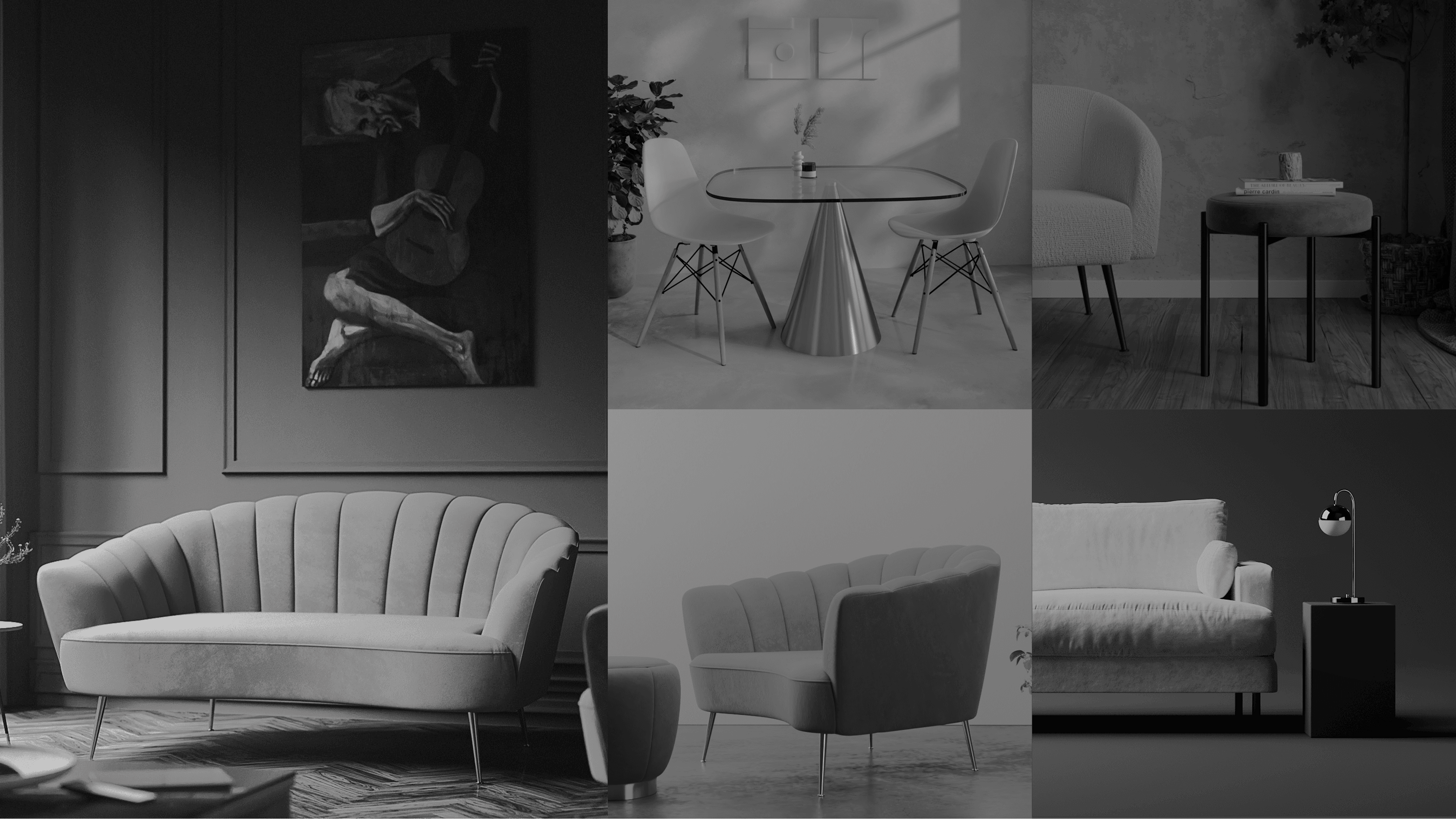
Brand direction — 'Design a life you love'
Research & Strategy
Understanding the market and the user
Through analytics, heatmapping and competitor analysis, we discovered that more than 60% of navigation happened below the fold — between the main banner and the recommendations carousel. This revealed a huge opportunity to better explore the homepage and drive engagement to underperforming sections.
Benchmarking against Made.com, Swoon, OKA, Barker & Stonehouse, West Elm and Habitat gave us a clear picture of where Cult could differentiate — not in price, but in personality. The brand needed to feel modern, young and confident, while remaining approachable.
We also restructured the brand name — reducing 'Cultfurniture' to simply 'Cult' — to create a shorter, more memorable identity coherent with the company's modern values.
Key problems identified
- No visual identity manual — each team interpreted the brand independently
- Green colour was impossible to apply consistently across digital and print
- Newsletter open rates were low due to poor visual appeal and inconsistent tone
- More than 60% of users browsed below the fold — homepage wasn't capitalising on this
- Navigation relied entirely on a complex bar — no visual card-based discovery
Brand principles defined
- Simple · Clean · Fresh · Adaptable — let the products do the talking
- Imagery: clean, unobtrusive backgrounds — no mixing of lifestyle and 3D in same asset
- Poppins as brand font — Semi-Bold for headlines, Regular for body copy
- Reduce categories in the carousel to the most impactful ones only
- Consistency across all omni-channel touchpoints: web, mobile, email, social
Colour palette, typography and brand system — Poppins as the brand typeface across all weights
Design Process
From wireframe to solution
The redesign process began with wireframes — restructuring the homepage to include three new promotional banners below the main hero, hero product promotion, and a social gallery connecting Instagram with the homepage for the first time.
We moved from low-fidelity wireframes to high-fidelity prototypes tested with real users, iterating based on heatmap data and A/B test results from the e-commerce team. Every decision was anchored in performance data rather than aesthetic preference alone.
Typography was central to establishing visual hierarchy: bold Poppins for titles, regular weight for body and CTAs. Most furniture companies prioritise UX over visual competition — the goal was to let users get to the product as fast as possible.
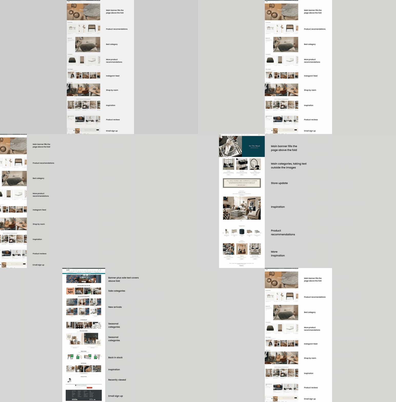
Wireframe to prototype — validated through A/B testing and heatmap analysis
The Solution
Simple, clean, fresh and adaptable
The redesigned homepage introduced three promotional banners below the main hero banner, directly addressing the under-exploited below-the-fold zone. A new card-based navigation system replaced the traditional bar for category browsing — updated dynamically and encouraging scroll-based discovery.
A social gallery was added to connect Instagram content directly with the homepage, creating a live editorial feel. Newsletter templates were rebuilt from scratch with consistent layout, Cult's new tone of voice, and clear visual hierarchy.
The brand refresh extended across homepage, mobile, social media and newsletters — creating a unified brand experience for the first time. The result: instantly recognisable to Cult's customers wherever they encountered the brand.
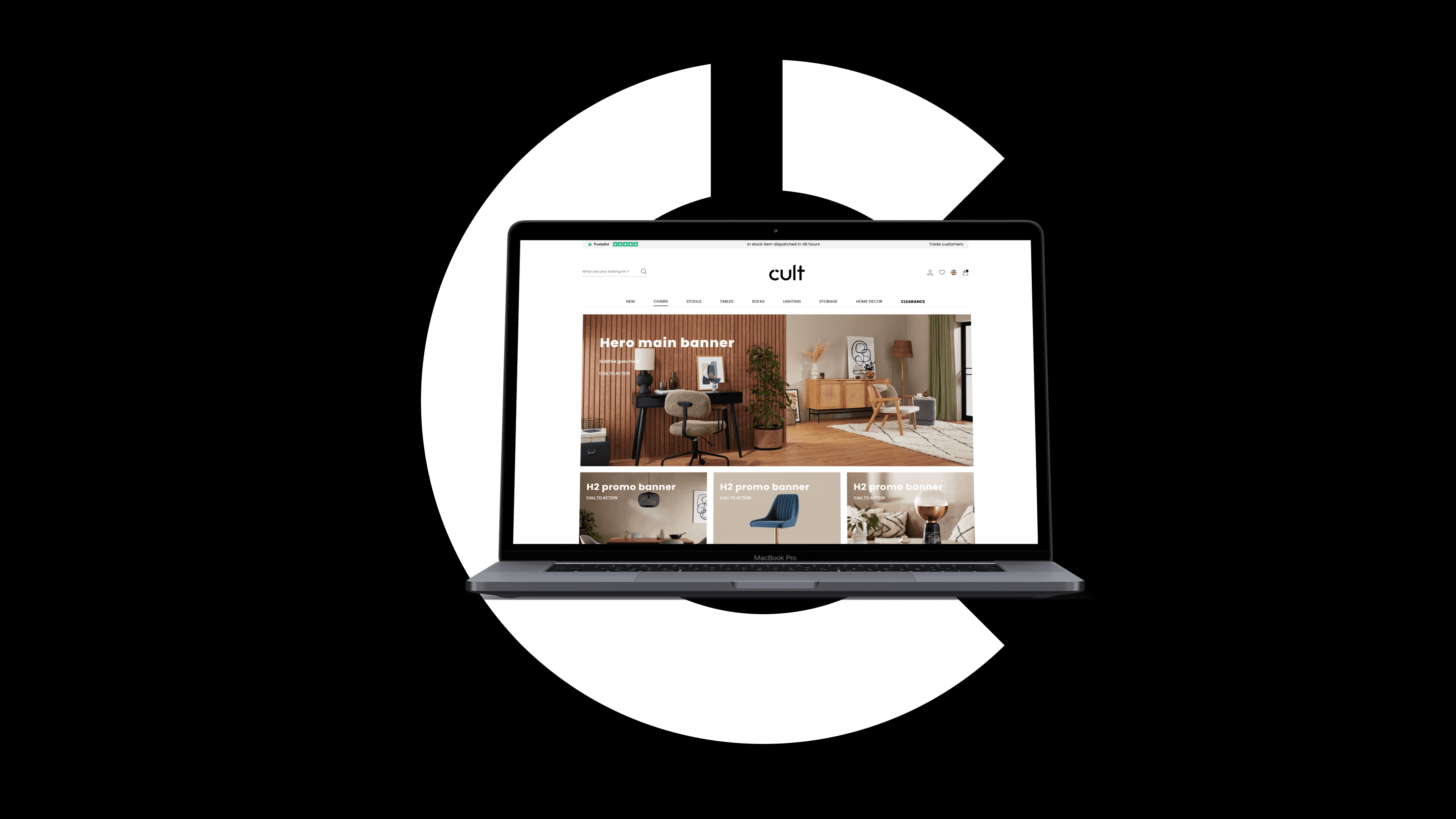
The redesigned homepage — clean, product-led and consistent across all breakpoints
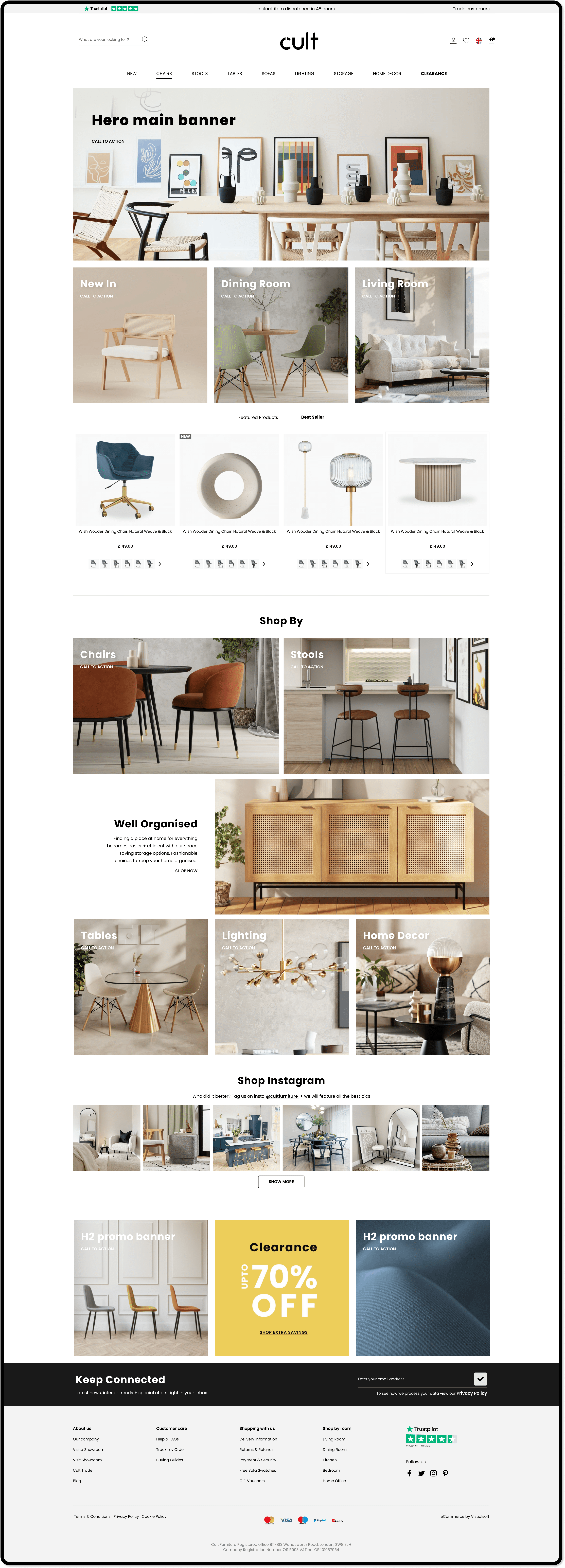
Full desktop homepage — hero, three promo banners, category navigation and social gallery
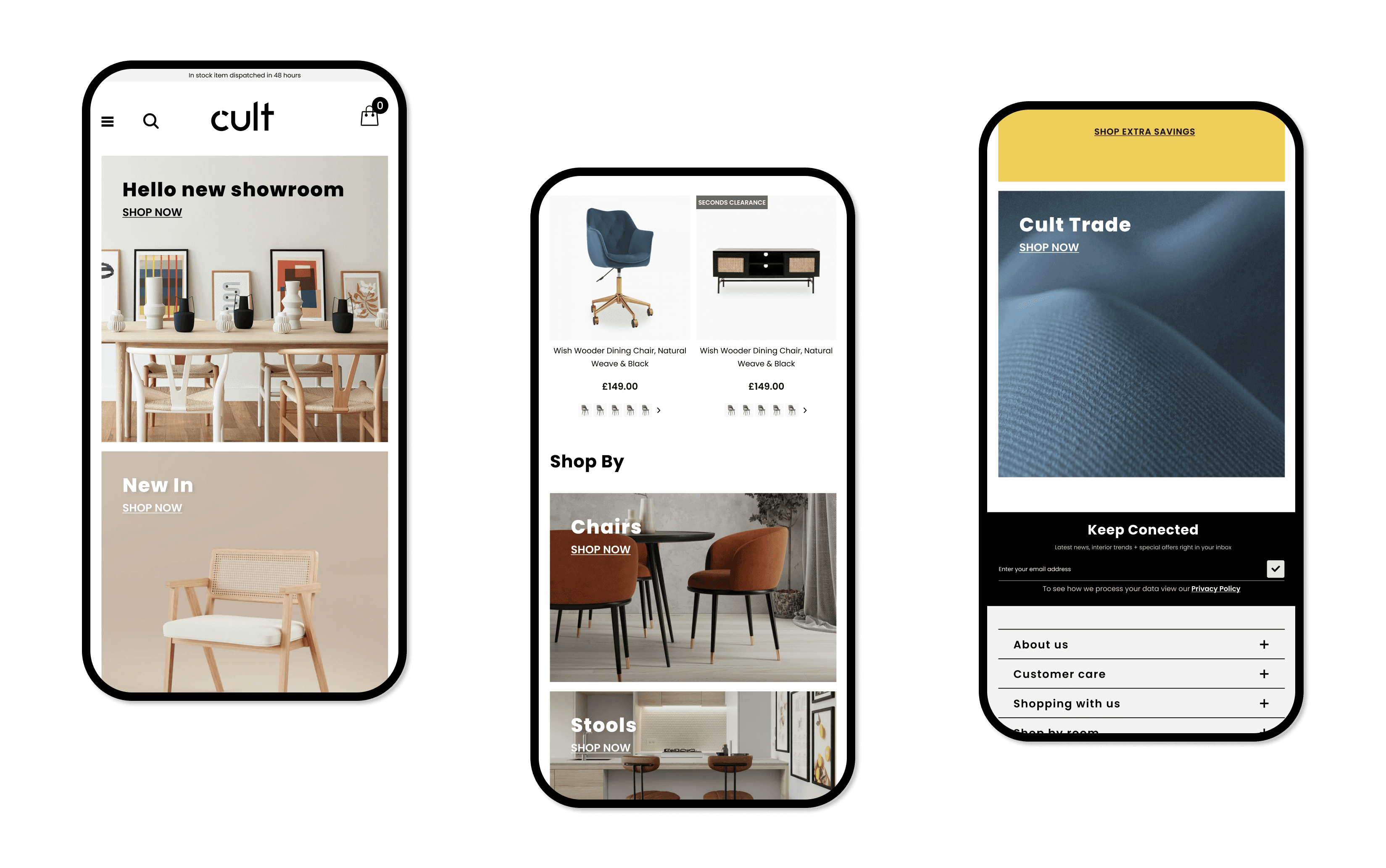
Mobile — responsive design maintaining the same visual language at every breakpoint
Next Project


