Case Study · Branding
Mallu Pães
Visual Identity
Year
2023
Role
Brand Designer
Client
Mallu Pães
Scope
Branding · Visual Identity
Mallu Pães is a handcrafted bakery brand born from a father-daughter love story. The challenge was translating an entirely human, warm and organic tradition into a visual identity that could stand proudly in modern markets — without losing a single gram of soul.
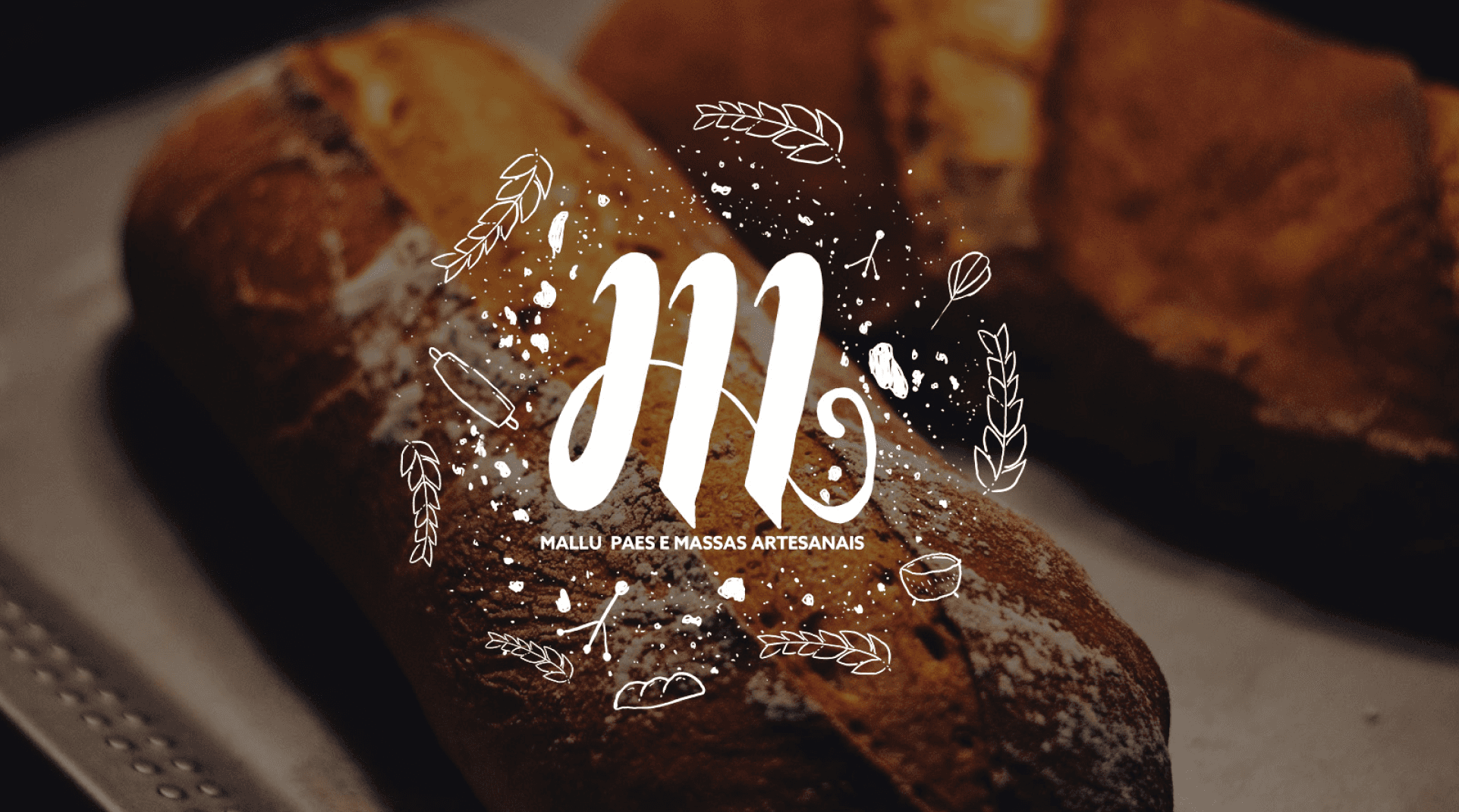
Hero concept — the brand mark against the warmth of fresh artisan bread
A family tradition, finally with a name
Mallu Pães was born from the passion of Claudio Maidana and his daughter 'Mallu'. The project's name honours her love for cooking and baking. The brand's proposal is simple and deep: handcrafted bread made with organic resources, minimal industrial process, maximum love. Recipes passed from generation to generation — carefully evolved, never lost.
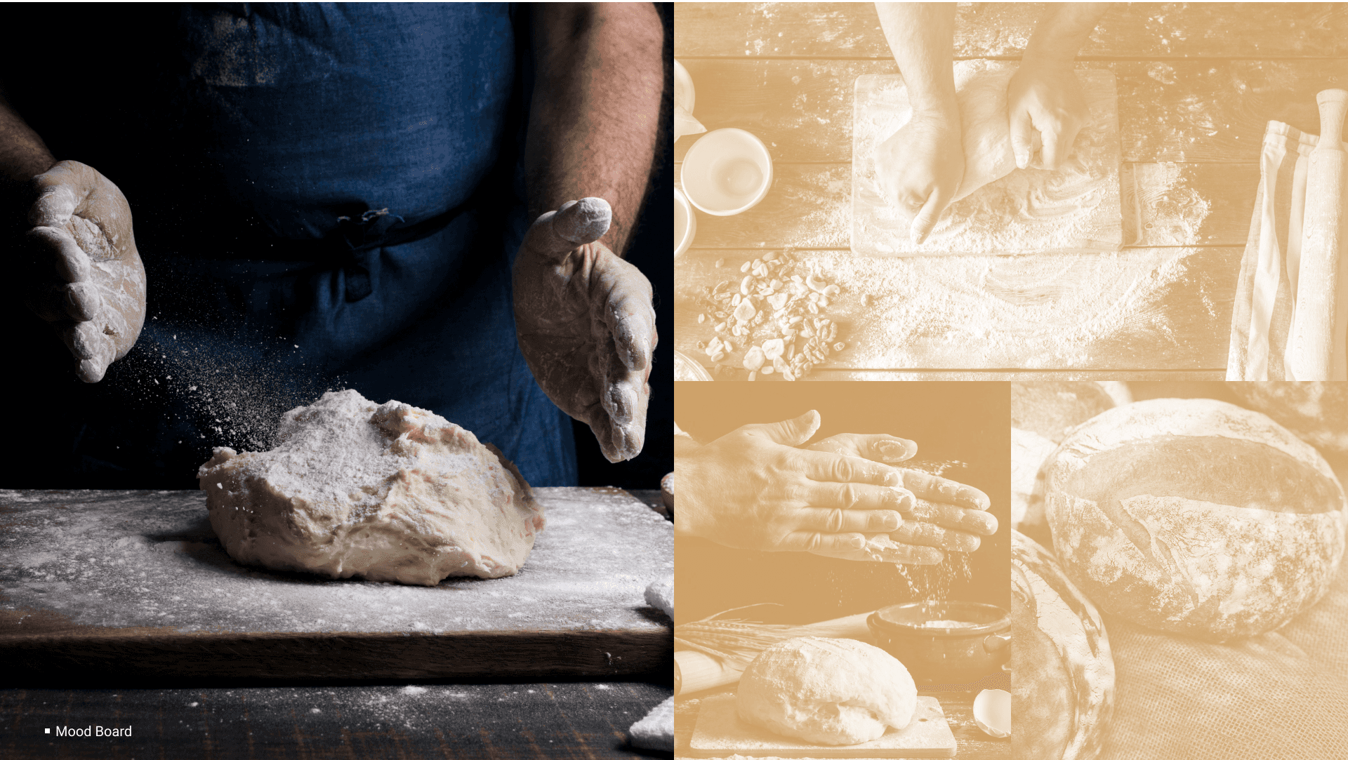
Brand mark development — hands, the letter M, and flour as texture
Flour on the table — the genesis of an idea
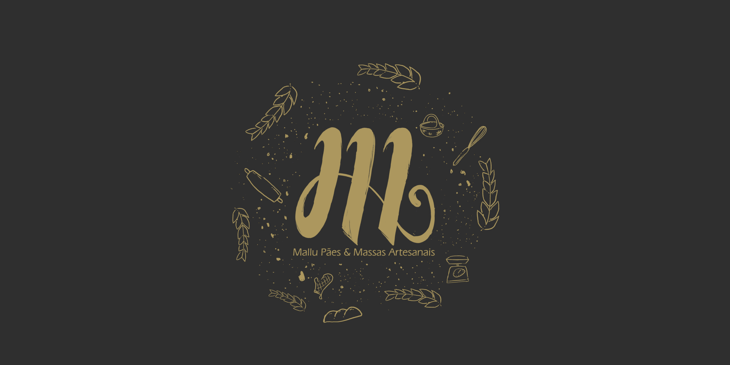
The visual identity needed to speak to manual processes. The same hands that knead the dough, shape the bread, and carry the tradition. We used the letter 'M' of Mallu as the structural anchor — merging it with an abstract hand form. The flour scattered across a table became the visual texture: raw, organic, alive. A mark that connects deeply with artisanal and natural processes.
"The flour sprinkled during preparation — that's the most honest moment of baking. We wanted the brand to live there."
— Diogo Figueira — Brand concept direction
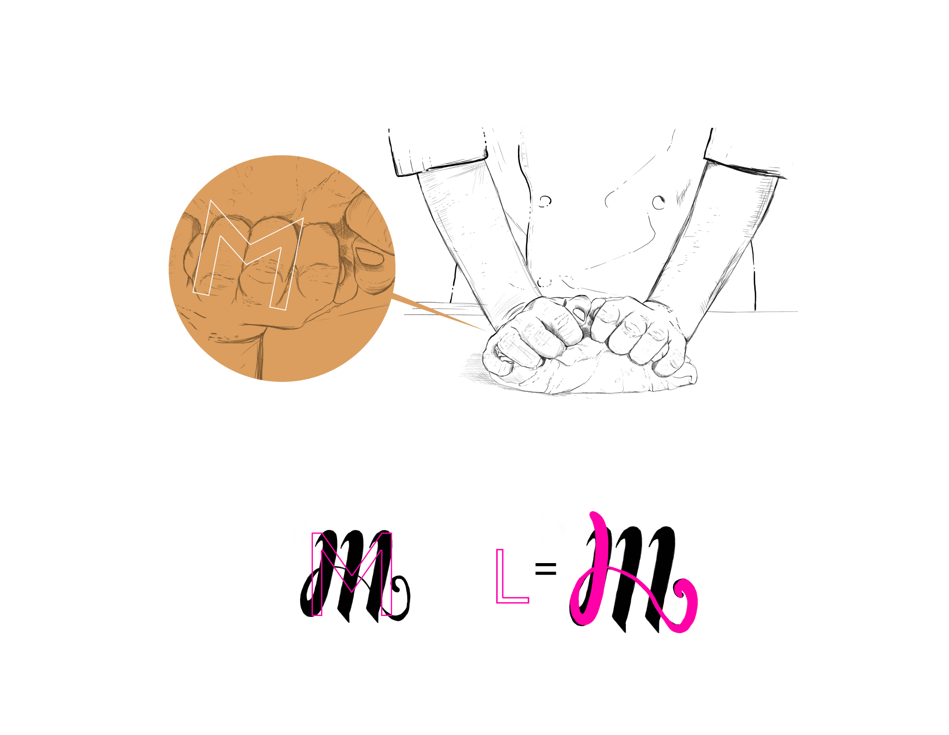
Brand applications across packaging, stationery and brand collateral
A full visual language, rooted in craft
From the primary mark to typography, colour palette, packaging and brand applications — every decision reinforced the same truth: this is made by hand, with care. Warm earth tones. Organic textures. A custom logotype that feels both modern and nostalgic. The full system was designed to work across kraft paper bags, social media, signage and beyond.
Full brand rollout — identity applied across all touchpoints

Packaging — kraft textures, warm earth tones, hand-crafted feel
Brand collateral — consistent visual language across every surface
Outcomes
1
Brand from scratch
zero to full identity
∞
Generations of recipes
handed down with love
100%
Organic process
minimal industrialisation
M
Symbol of the brand
hands + letter + flour
Reflection
When a brand feels like a hug
Mallu Pães was one of the most emotionally rich briefs I've worked on. The story was already beautiful — the job was not to invent anything, but to listen and translate. The flour metaphor came naturally once I stopped thinking about "design" and started thinking about the kitchen.
This project reminded me that the best brand work feels inevitable. Every mark, every texture, every colour should feel like it could only ever have been this way. With Mallu Pães, I think we got there.
Next Project